Tipsy Drops
Brand Guide
Girls just wanna
have fun drinks
Built on an all-natural foundation, Tipsy Drops balances a playful, vibrant personality with thoughtful intention. Designed to resonate with hardworking women, our brand extends beyond its current product line to embody a feeling and a lifestyle. Tipsy Drops isn’t just a martini brand. It’s an escape in a bottle, bringing a sense of relaxation, joy, and celebration to everyday moments. Whether enjoyed at home or with friends, it captures the feeling of being on vacation, no matter where life takes you.
The core of our brand
Our Logo Suite

Primary Logo
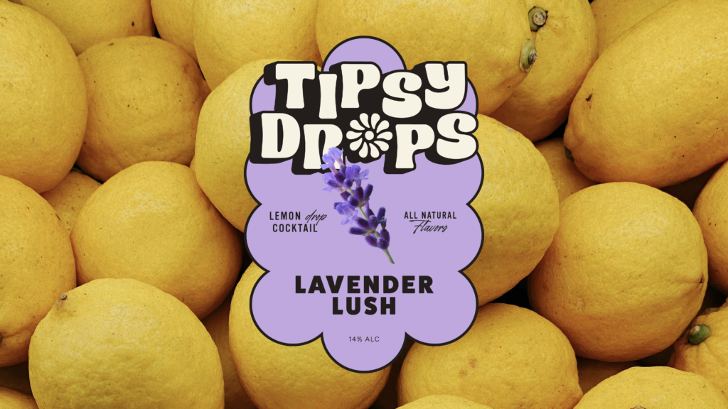
Tipsy Drops' Primary Logo is the central expression of the brand, designed to reflect its vibrant, natural, and playful personality. Set in a chunky, inviting typeface with a dynamic, staggered composition, it captures the brand’s core ideas of vibrancy and energy in a single cohesive mark.
It should serve as the primary brand identifier across key applications, including packaging, marketing materials, and digital touchpoints, where a strong and confident presence is needed. The Primary Logo should be on all official collateral when space allows. Only set it in the following approved colorways, primarily showcasing the mark in Warm White and Rich Black. The True White and True Black colorways are only to be used on brand partnership collateral when required by brand partners.
Logo Primary White and Black
Logo Primary True White and True Black

Shadow Icon
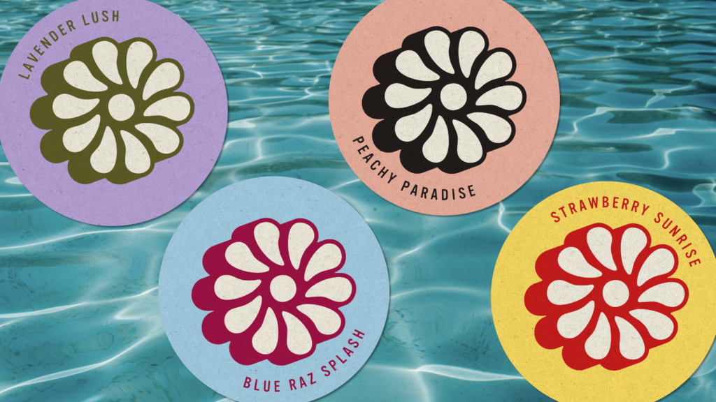
Our Icon serves as a bold and recognizable expression of the Tipsy Drops' brand. Inspired by the sun, a flower, and the center of a citrus fruit, it captures the bright, natural energy that defines the brand. Its simple form makes it ideal for small-scale applications such as social media profiles, favicons, merchandise, and packaging details.
Our Icon should primarily be set in the Warm White and Rich Black colorways, but other brand colorways are allowed so long as the shadow is a darker color than the base of the mark.
Shadow Icon White and Black

Shadow Icon White and Green

Shadow Icon White and Raspberry

Shadow Icon White and Red

Flat Icon
Our Flat Icon follows the same usage principles as our primary Icon, offering a simplified version without the drop shadow for added flexibility. It is ideal for applications with limited space or production constraints, such as favicons, embroidery, and small-scale brand touchpoints. The Flat Icon can also be used as a graphic element across social media, merchandise, packaging, and other brand applications where a cleaner, more minimal expression is preferred.
Flat Icon Black

Flat Icon White

Flat Icon Sand

Flat Icon Green

Flat Icon Raspberry

Flat Icon Red

Flat Icon Pink

Flat Icon Peach

Flat Icon Lavender

Flat Icon Blue

Flat Icon Yellow
Shadow Icon Badge
Our Shadow Icon Badge features the signature burst element from our Primary Logo. It captures the bright, fresh, and playful spirit of Tipsy Drops while reinforcing the brand’s connection to natural ingredients and vibrant flavors. As a simplified brand element, the Icon Badge can be used across social media, merchandise, packaging, and supporting graphics to reinforce brand recognition.
Use only the approved colorways, including any designated colors for the drop shadow variation when needed. The badge should generally appear in a single color; however, the drop shadow version may utilize two brand colors, provided the base color is lighter than the shadow color. It should never be combined with unapproved color treatments that compromise legibility. The badge is intended to be used as a design element when size and space allow.
Shadow Icon Badge White and Black
Flat Icon Badge Black
Flat Icon Badge White
Flat Icon Badge Sand
Flat Icon Badge Green
Flat Icon Badge Raspberry
Flat Icon Badge Red
Flat Icon Badge Pink
Flat Icon Badge Peach
Flat Icon Badge Lavender
Flat Icon Badge Blue
Flat Icon Badge Yellow
our logo
Usage
Safe Space
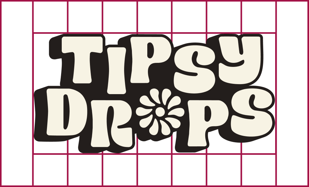
When displaying any of the logo variations, maintain ample space around it to avoid crowding or interference from other elements. To achieve this, don’t place anything within the “safe space” equivalent to 10% the width of the logo.
*Of course, there are exceptions: subtle patterns or textures overlapping at 20% opacity or less are acceptable.
Please Don't
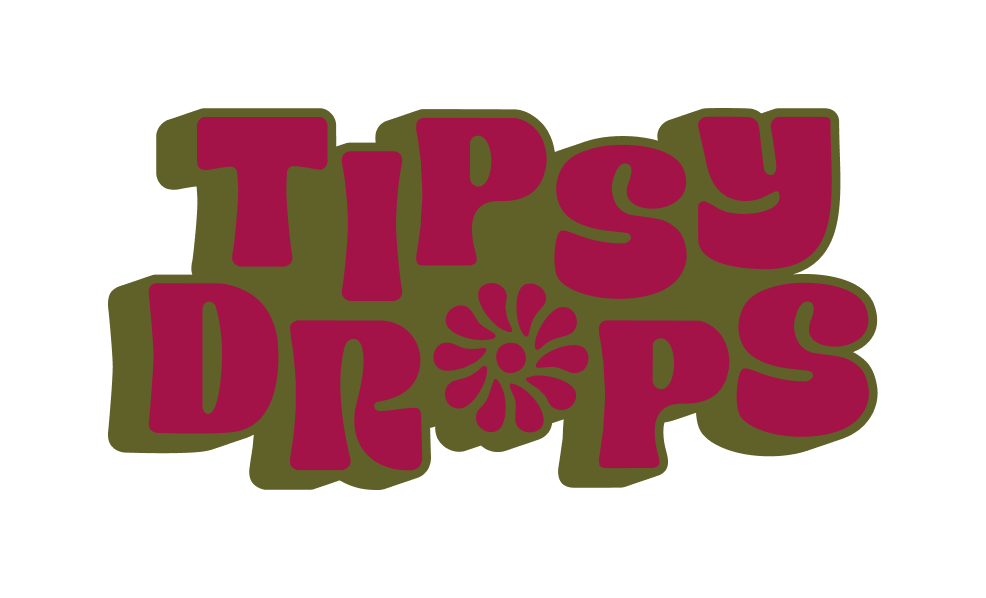
Use unapproved color combinations or colors
Distort the logo and elements

Mask images into the logo
Remove dropshadow
Knock out type in logo
Tipsy Drops in
Color
Primary Colors
Rich Black
- Hex #231E1C
- RGB 35, 30, 28
- CMYK 67, 67, 67, 75
- Pantone 447 C
Warm White
- Hex #F7F3E4
- RGB 247, 243, 248
- CMYK 2, 3, 11, 0
- Pantone 7499 C @ 40%
Secondary Colors
Our Secondary Colors are used on key graphics and to highlight key information such as banners and social posts.
Sandy Tan
- Hex #A08055
- RGB 160, 128, 85
- CMYK 32, 47, 77, 10
- Pantone 465 C
Garnish Green
- Hex #606029
- RGB 96, 96, 41
- CMYK 57, 45, 100, 31
- Pantone 2279 C
Raspberry Raspberry
- Hex #A31347
- RGB 163, 19, 71
- CMYK 22, 100, 60, 11
- Pantone Rubine Red C
Strawberry Red
- Hex #CE1D1D
- RGB 206, 29, 29
- CMYK 5, 100, 100, 1
- Pantone 3546 C
Sunset Pink
- Hex #FF8894
- RGB 255, 136, 148
- CMYK 0, 65, 24, 0
- Pantone 190 C
Peachy Peach
- Hex #F2B5A2
- RGB 242, 181, 162
- CMYK 0, 37, 32, 0
- Pantone 4064 C
Lavender Purple
- Hex #BEA8DD
- RGB 190, 168, 221
- CMYK 22, 35, 0, 0
- Pantone 2086 C @ 75%
Buzzy Blue
- Hex #A9D4EA
- RGB 169, 212, 234
- CMYK 36, 3, 3, 0
- Pantone 7458 C @ 55%
Lemon Yellow
- Hex #FFE164
- RGB 255, 225, 100
- CMYK 0, 10, 82, 0
- Pantone 3965 C
Typography
Our Font Families
Subheadings & Buttons - Vinyl OT Regular, All Caps, +100 Tracking
ABCDEFGHIJKLMNOPQRSTUVWXYZ1234567890!@#$%^&
Headings - FatFrank Regular, All Caps, +10 Tracking
ABCDEFGHIJKLMNOPQRSTUVWXYZ
1234567890!@#$%^&
Accent - The Youngest Regular, Sentence Case
Aa Bb Cc Dd Ee Ff Gg Hh Ii Jj Kk Ll Mm Nn Oo Pp
Qq Rr Ss Tt Uu Vv Ww Xx Yy Zz
1234567890!@#$%^&
Body - Figtree Regular, Sentence Case
Aa Bb Cc Dd Ee Ff Gg Hh Ii Jj Kk Ll Mm Nn Oo Pp
Qq Rr Ss Tt Uu Vv Ww Xx Yy Zz 1234567890!@#$%^&
depth through
Design Elements
Photography
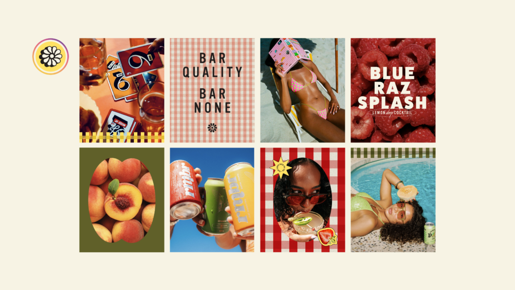
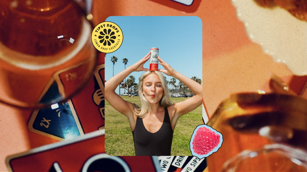
Our Photography captures people and products in natural, everyday moments, using flash and bold contrast to reinforce Tipsy Drops' vibrant, refreshing personality. The result is imagery that feels authentic, energetic, and full of life, showing how Tipsy Drops naturally fits into every occasion.
The provided photobank can serve as a starting point for texture photography, helping maintain a cohesive visual language across the brand.

Texture
Inspired by the natural ingredients behind every Tipsy Drops' flavor, the Texture brings an organic, handcrafted quality to the brand. It adds depth, visual interest, and cohesion across applications while reinforcing the brand’s fresh and flavorful personality.
Our Texture is only to be used with a multiply effect added to show an underlying brand color.

Real Fruit Imagery
Our Real Fruit Imagery adds a fresh, natural authenticity to our packaging, key graphics, and other brand applications. It reinforces the natural ingredients and vibrant flavors behind Tipsy Drops while bringing color, energy, and visual appeal to the overall brand experience.
Holding Shapes
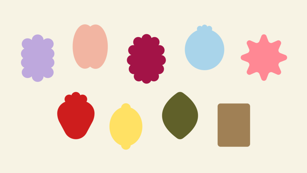
Our Holding Shapes draw inspiration from the fruits and flavors found throughout the Tipsy Drops' lineup, adding a playful, expressive element to the brand. They bring flexibility and personality across packaging and key graphics while helping create a cohesive visual language.
Use each shape in a single brand color at a time, as well as holding shapes for images, applying the stroke treatment to packaging only, and removing it in other brand applications. Additional shapes may be used as needed, provided they maintain the brand’s soft, rounded-corner aesthetic.
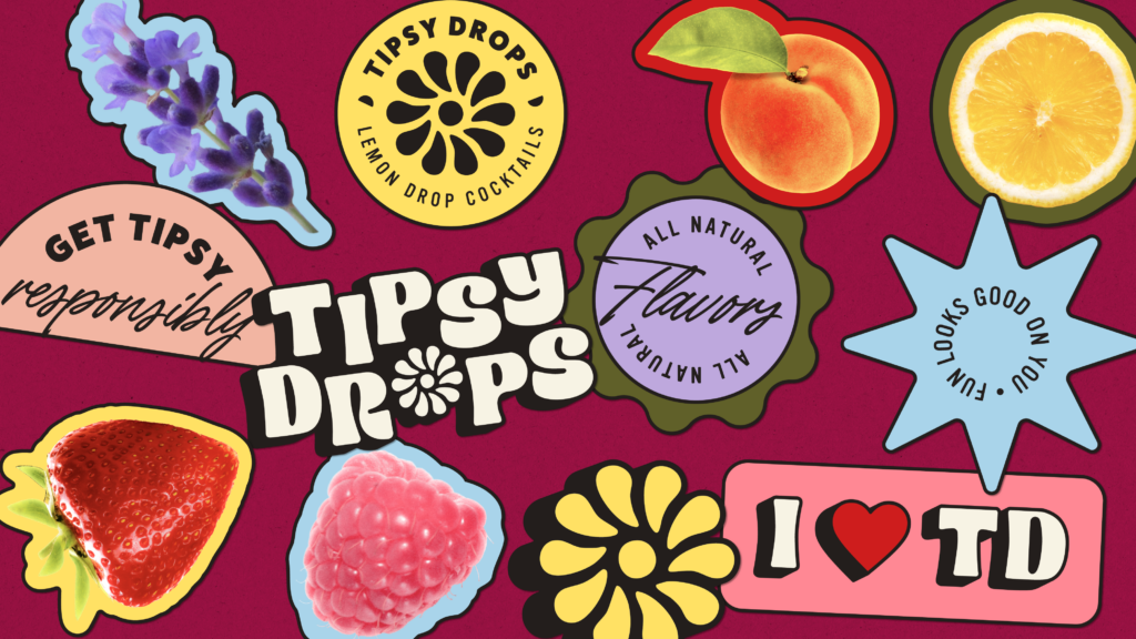
Stickers
Tipsy Drops' Stickers are a fun and flexible way to bring personality and energy to the brand. They pair seamlessly with our Holding Shapes and can be used across packaging, key graphics, and other brand applications. Available in a variety of colors, the stickers can be rotated and layered to create a sense of movement, spontaneity, and visual interest.
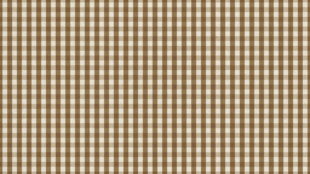
Gingham Pattern
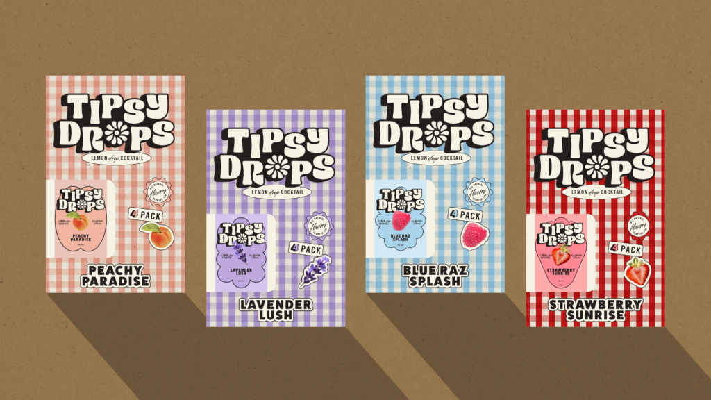
Our Gingham Pattern makes Tipsy Drops feel timeless while adding a sense of warmth, familiarity, and charm to the brand. It serves as a versatile graphic element that can be used across packaging, marketing materials, and key brand applications, either as a full background or as a design accent in a stripe format.
Brand in action
Application